


 |
| This page is some of our ideas of fonts and colours that we thought might work in our separate issues. We experimented with lots of different fonts, sozes shapes, colours etc to find the most appropraite. |

 |
| This page shows how we developed our ideas and started to develop ideas for each others issues. All of the examples are girly but all appropriate to the issues we chose to do. For example the first one is like bubble gum and a very acidic pink to go with the candy theme, the second one is clearly made for a Christmas issue and the final one is gold to match the new years issue. |
 |
| We found this font on 'MyFonts' and played around with it making it bolder and experimenting with the colours. It was called 'lipstick' and seemed to be very fitting for our magazine. We had complications using this font on Photoshop or InDesign however. |

 |
| This was the questionnaire that we created to find out what we would need to include in our magazine. We used a photograpgh of a magazine appealing to our target audience and found out what they liked or disliked about it. We collected this data by putting the questionnaire on 'Survey Monkey' and used the data to make our magazine appeal to our target audience as much as possible. |
 |
| This was our first mock up of our plan for the front cover of our final piece. We did this to make sure we knew what we were doing when it came to making the actual magazine. We needed to include all the codes and conventions and lay them out in an approproate mannor. |
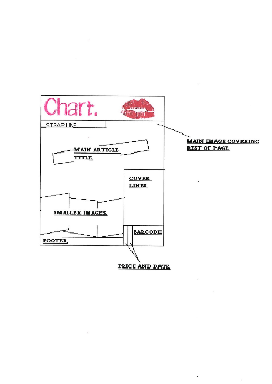 |
| This was reproduced once we had looked at some text and colour options and also decided that a logo would look good on it. |
 |
| This is the origonal plan for the contents page. This plan was to be followed as closely as possible but we did realise that some things may need to be changed for one reason or another. These were things like photo sizes or amount of text used. |
 |
| This was the first idea for the double page spread and the one we finally chose to use. |
 |
| This was another idea that we came up with. We chose to lay them out in these two ways as we had done some research and found that these were the two most common ways that dps were layed out. However this second choice seemed to be a lot more formal than the toher and therefor not as appropriate for our target audience. |
 As a group we had started to create some magazine front covers and contents pages. We used our own photography and basic programmes like Photoshop. As you can clearly see we were unable to finish these. However this helped us to realise how long creating our final piece would take.
  We had learnt some very basic codes and conventions of magazines and has started to put these into practise. Doing these tasks also helped us to get to grips with some of the technology.
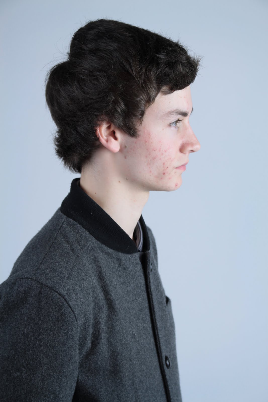
 I wanted some close-ups of each member of the band as i thought that these would be useful on the contents page. I made sure i had a couple of each band member to choose from.
  All the close-ups I collected of the boys were from different angles, sizes etc. This was done to make the magazine more interesting and give it a youthful and quirky feel.
 I feel that these images capture a different personality trait in all the boys. This is perfect as boy bands usually have a conventionally good looking one, cute one, cheeky one, and masculine one.
 These photographs show that this member of the band is the cheeky/quirky one.
 This was the image i chose to use in the final magazine.
 These images are ideal for a poster offer and therefor i used them on the front cover as a smaller image.

 Again a different angle has been used to add something to the magazine. Even though we can not see his entire face it is a very powerful image that really works.
 This is when we started looking for a front cover image...
 A few things were wrong with this: Feet can be seen, the member at the back is to dark and you are able to see black at the side.
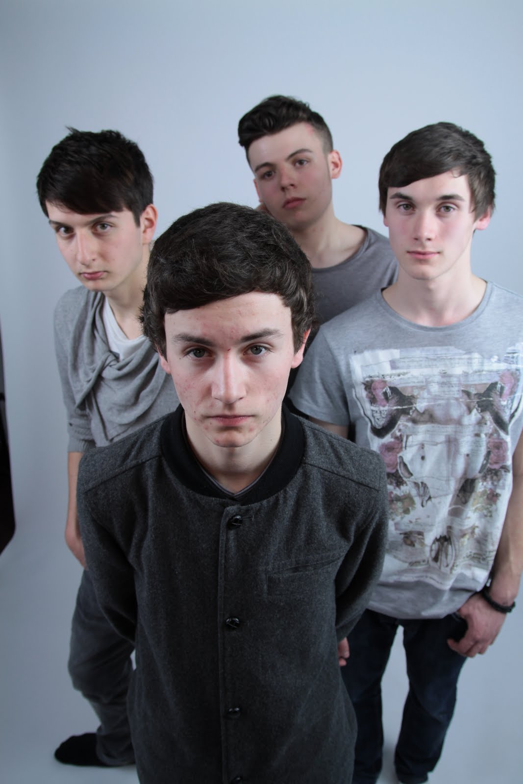
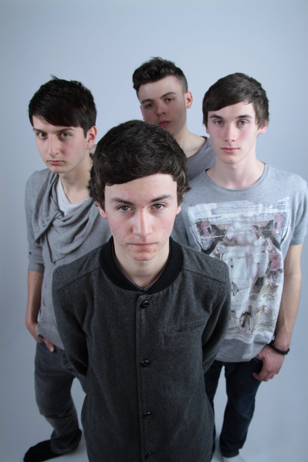

 This image was the on I chose to use for the double page spread as the landscape set out is perfect for a double page spread. It has a similar look to the front cover image which is ideal for the look we were going for.


