 |
| This was our first mock up of our plan for the front cover of our final piece. We did this to make sure we knew what we were doing when it came to making the actual magazine. We needed to include all the codes and conventions and lay them out in an approproate mannor. |
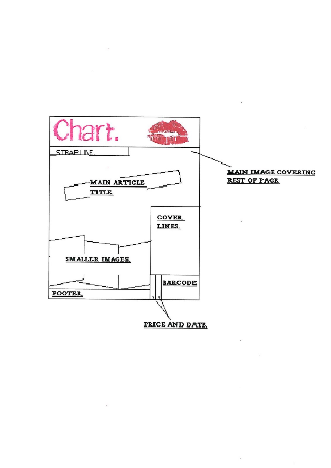 |
| This was reproduced once we had looked at some text and colour options and also decided that a logo would look good on it. |
 |
| This is the origonal plan for the contents page. This plan was to be followed as closely as possible but we did realise that some things may need to be changed for one reason or another. These were things like photo sizes or amount of text used. |
 |
| This was the first idea for the double page spread and the one we finally chose to use. |
 |
| This was another idea that we came up with. We chose to lay them out in these two ways as we had done some research and found that these were the two most common ways that dps were layed out. However this second choice seemed to be a lot more formal than the toher and therefor not as appropriate for our target audience. |
No comments:
Post a Comment