
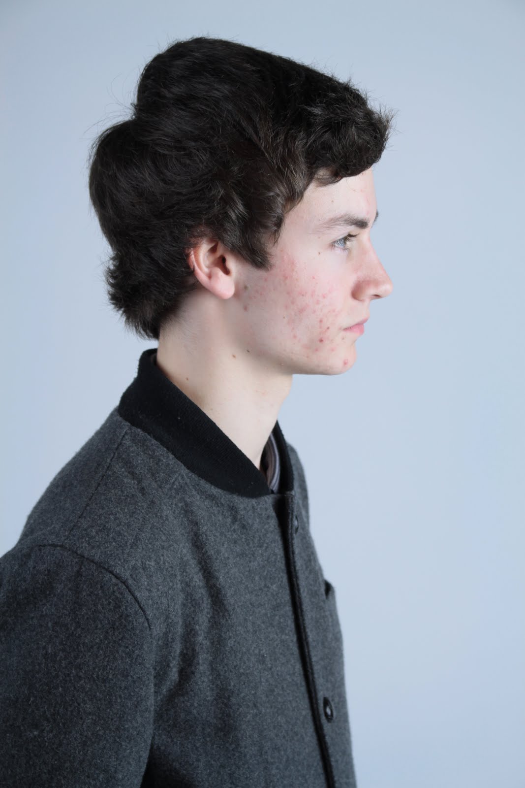
I wanted some close-ups of each member of the band as i thought that these would be useful on the contents page. I made sure i had a couple of each band member to choose from.

All the close-ups I collected of the boys were from different angles, sizes etc. This was done to make the magazine more interesting and give it a youthful and quirky feel.

I feel that these images capture a different personality trait in all the boys. This is perfect as boy bands usually have a conventionally good looking one, cute one, cheeky one, and masculine one.

These photographs show that this member of the band is the cheeky/quirky one.

This was the image i chose to use in the final magazine.

These images are ideal for a poster offer and therefor i used them on the front cover as a smaller image.

Again a different angle has been used to add something to the magazine. Even though we can not see his entire face it is a very powerful image that really works.

This is when we started looking for a front cover image...

A few things were wrong with this: Feet can be seen, the member at the back is to dark and you are able to see black at the side.

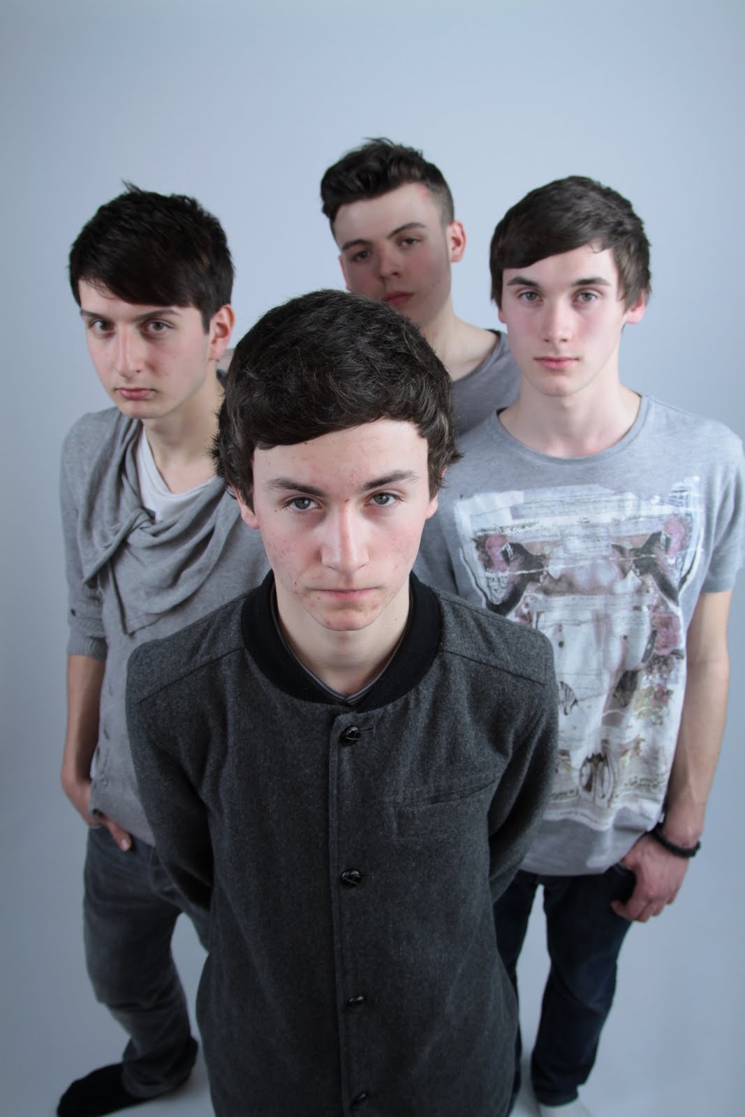
This image was the on I chose to use for the double page spread as the landscape set out is perfect for a double page spread. It has a similar look to the front cover image which is ideal for the look we were going for.
 I wanted some close-ups of each member of the band as i thought that these would be useful on the contents page. I made sure i had a couple of each band member to choose from.
  All the close-ups I collected of the boys were from different angles, sizes etc. This was done to make the magazine more interesting and give it a youthful and quirky feel.
 I feel that these images capture a different personality trait in all the boys. This is perfect as boy bands usually have a conventionally good looking one, cute one, cheeky one, and masculine one.
 These photographs show that this member of the band is the cheeky/quirky one.
 This was the image i chose to use in the final magazine.
 These images are ideal for a poster offer and therefor i used them on the front cover as a smaller image.

 Again a different angle has been used to add something to the magazine. Even though we can not see his entire face it is a very powerful image that really works.
 This is when we started looking for a front cover image...
 A few things were wrong with this: Feet can be seen, the member at the back is to dark and you are able to see black at the side.
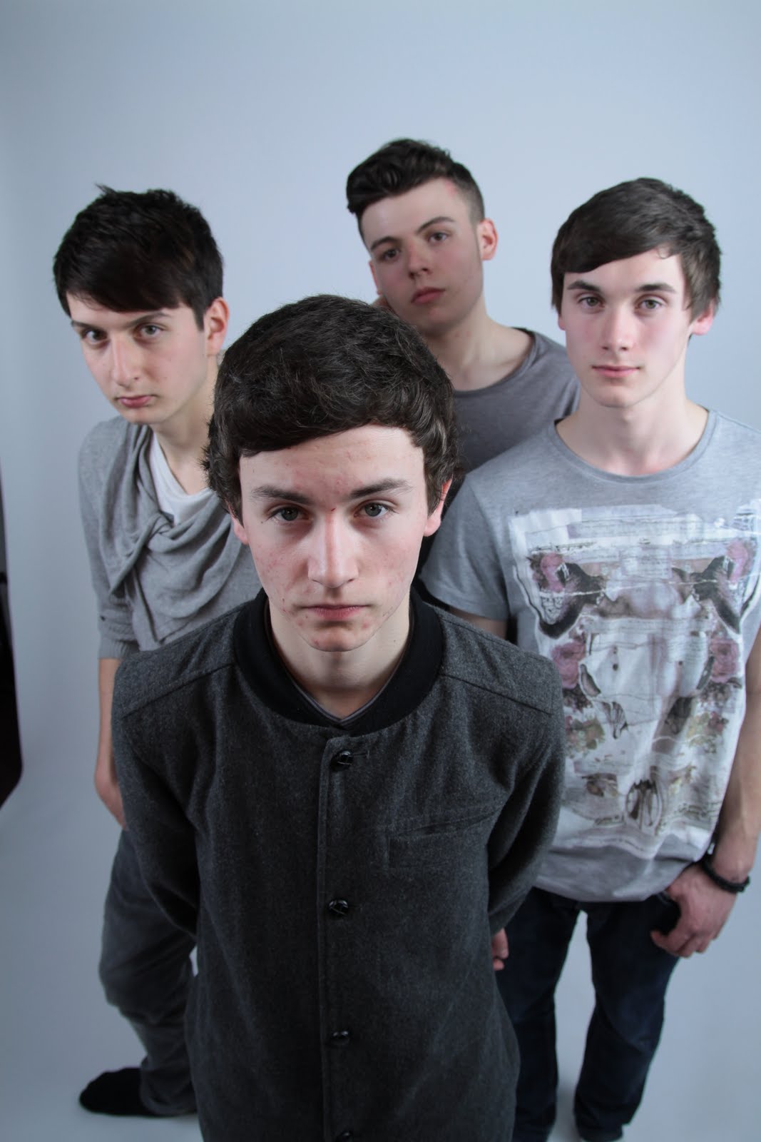

 This image was the on I chose to use for the double page spread as the landscape set out is perfect for a double page spread. It has a similar look to the front cover image which is ideal for the look we were going for.
No comments:
Post a Comment